top of page

KLOVE Branding Refresh
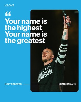
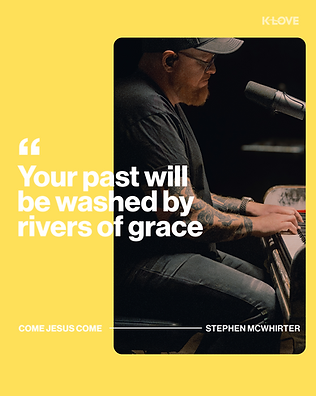
As a Graphic Designer for K-LOVE I had the opportunity to completely refresh the KLOVE branding. I initially met with my Art Director who gave me the vision/inspo. Though our branding is very simple and therefore cohesive, the goal was to bring in more personality, creativity and variety. One brand that stuck out as inspiration was Spotify. Their brand incorporates a lot of different elements and colors but has underlying structure and is cohesive. I first created mood boards gathered from pinterest, social media, and also other brand examples. Next, I grouped all of my inspo into different directions. Once I started designing I then showed my Art Director as I went to make sure I was on the right path. I then chose a color palette based on the main KLOVE color, cyan. Here is what I came up with and what was presented to my team and also the social/web teams:
Current Designs:
Color Palette


Web Asset Design Examples


Social Media Grid Design Examples


bottom of page